
Building brands
+ businesses
We partner with ambitious and purpose-driven teams to accelerate growth. Let’s find your path forward together and uproute your brand.
Ecommerce B2C brand with 5 straight years of growth through email marketing and advertising.
- Email Marketing
- Paid & Social Advertising
- Marketing Strategy
- Shipping Integrations
- Web Design & Development


Shoreline Fruit
An asset management company rebrand aimed at positioning the firm to reach a new audience.
- Business & Brand Strategy
- Brand Identity
- Collateral Design
- Website Design + Development
- Rollout + Implementation


Evergreen
A high-end landscaping design, installation, and maintenance company looking to take their marketing to the next level.
- Brand Strategy
- UI Design
- Web Development
- Email Marketing
- Paid & Social Advertising
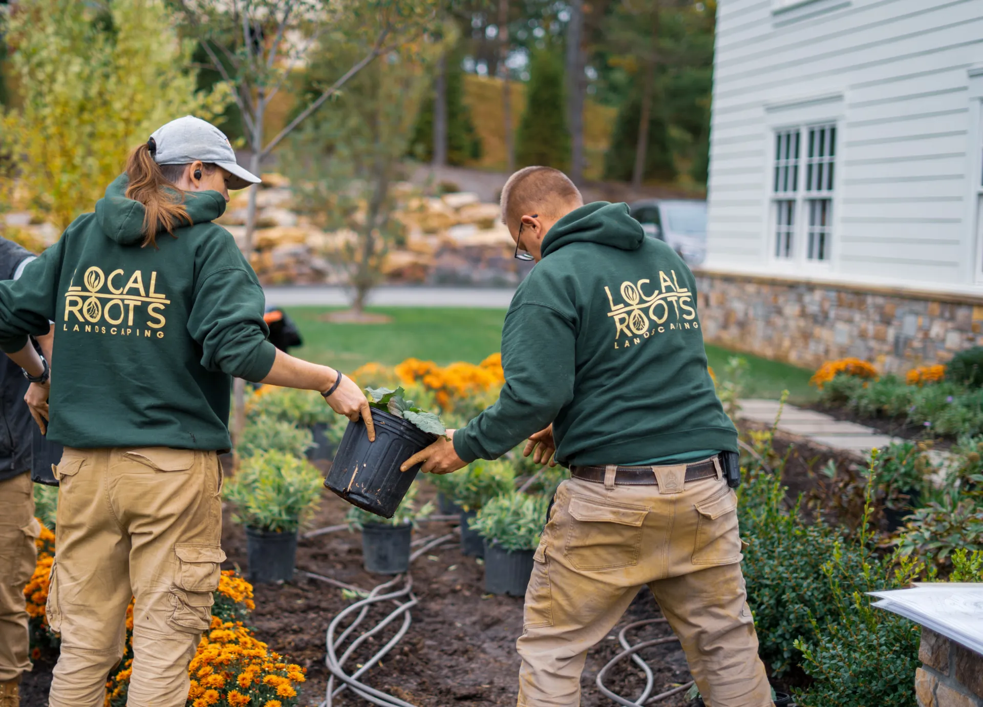

Local Roots
Branding a clothing startup that is changing the industry through innovative tailoring solutions.
- Business & Brand Strategy
- Brand Identity
- Collateral Design
- Website Design
- ECommerce Development


Olive
A meal delivery company expanding their reach to bring a healthier balance to more customers.
- Business & Brand Strategy
- Brand Identity
- Collateral
- Website Design
- ECommerce Development


Kitchen Repose
A kids coding game launching a complete brand refresh and digital marketing efforts.
- UI Design
- Web Development
- SEO Strategy
- Email Marketing
- Paid & Social Advertising


Kodable
Integrated marketing, dealership advertising, and business strategy to grow a dealership over 30% per year.
- Web Development
- Paid & Social Advertising
- Dealership Strategy
- Technical Strategy & SUpport
- Operations Consulting


Dog Guard
